Monday 28 March 2011

Fonts


These are some of the fonts that I altered in order to fit with the Genre and colour scheme as well as taking into account the fonts which stand out the most. I settled on the last sample with the title Bass, I also settled on the colour scheme of red and black writing on quite a plain back ground something which can be seen on the magazines I have looked at previously.

Magazine Covers


VIBE
 Focuses more on the RnB aspect of the music world, Title is in large bubble font that stretches across the full top 5th of the page. Above this there is smaller writing in yellow and white alternate suggesting to the reader something to do with these people are inside. The mise-en-scene is black background, Drake takes up the main centre of the page showing the audience he is important and he also has black accessories. There is a yellow and white colour scheme on a black back ground, it also contains links to the website and a barcode and issue addition. The writing shown on the tshirt of the centre model is also close to the heading of the magazine. The shot used is a medium close up. There is also bright font showing an exclusive interview, showing the reader what to expect. The act that drake is wearing a black cap and tshirt on a black background could reflect the magazines African American audience.
NME
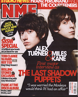
Is a more accredited magazine and more widely recognised in the music industry, its target audience is the Indy/ rock genre. There is a lot more happening on the NME cover than on the simplistic cover of VIBE, the main picture is to the right hand side and is a medium shot of two people standing back to back on a white plain back ground, the interview and description of the feature article is a lot more prominent on the cover of NME with red writing on a black background of the picture along with a quote. It also contains a bar code and issue number, the title is conventional of NME and is red with white outline and a black border. Above this there is also a news section giving the audience more information as to what to expect. All the information is contained down the left hand side of the magazine cover unlike VIBE where the information was split across both sides highlighting how Drake was the centre of this magazine issue and had made a lasting impression.

Background work

My magazine is a blend of two different genres in order to attract a larger audience. I have combined both the dance and music magazines and took ideas from some of the biggest and most widely selling magazines today. “Vibes” is one of the biggest selling RnB magazines to date and I have chose to look at the contents page due to its distinctive style. The section I have paid close attention to is the logo and layout of the word contents.


The magazine I chose to look at the front cover of is mixmag this is a widely selling dance magazine and I feel by combining both of them it will benefit my magazine greatly due to it being a very distinctive style. The part I have paid close attention to is the heading and also the spread across the centre of the page with it being very eye catching due to the font, language and colours used.

Preliminary

My contents page was kept simple as I think this has the common conventions of a school magazine due to them not being very large. The contents page reflects this however I have used some photoshop skills such as cutting out the models.

I designed my front cover around the school logo by using the blue and yellow colour scheme, the background I used was fairly dark and plain this incorporated the models dark clothes.

As part of our project we had to create a school magazine, this allowed us to become familiar with the set up of photoshop as well as experimenting whilst taking pictures. I made my magazine and contents page how I thought would best suit a school magazine.