Thursday 12 May 2011

Final Project

 Front Cover                                                                                                      Contents Page


Feature Article

Thursday 5 May 2011

Evaluation- Video Progress

Evaluation-(Looking back to your preliminary task, what do you feel you have learnt in the progression to it to the full product?)


Discussing my finnished project.

Evaluation-(What have you learnt from technologies from the process of constructing this product?)

Just a short clip, containing my views on adobe photoshop and why we used it.

Discussing the skills I have learnt whilst carrying out my project. As said we used adobe photoshop due to not having any other facilities available, however I feel my project still looks proffessional due to the image minipulation I carried out as well as everything else that has went into it.


Just adding a bit more onto my first clip.


Evaluation-(Who would be your audience for your media product and How did you attract address your audience)

My target audience is males between the ages of 16-24, they will usually be of working class back ground and therefore the magazine must be priced to target this audience, they will usually be knowledgable about the genre, and usually attend events.

After handing out a questionnaire I decided to market my magazine at the price of £2.50. This is aimed at the lower end of the market and will be released fortnightly.


The thing that attracted most people to my magazine was:


The colour Scheme was the thing that most attracted people, followed closely by the layout and colour scheme of my front cover.


Alex is 18 and a full times sales assistant, his average income is £800 per month. He admits sometimes things can be financially difficult, however he is a music lover and admits the magazine is reasonably priced for what it contains. It is a relativley small price but it contributes to the £50-£60 he spends per month on music related items. He is the type of individual that I am attempting to target with my magazine.

Attraction of Audience
I attempted to attract the audience by using a model that is of a similar age to the target audience. The model is also wearing similar close to the target audience so therefore the audience will be able to feel closer and part of the magazine, giving them a sense of ownership.

I attracted my audience by carrying out close analysis of products such as Mixmag and Vibes, this then allowed me to develop my magazine by placing hooks on the front cover for give aways and prizes.

Evaluation- (What kind of media institution might distribute your media product?)

The most likely group to take on a distribute my magazine would be Bauer, it is Europes largest privatley owned publishing group with over 230 magazines in 15 countries. This is something extremely beneficial to my magazine due to it reaching more countries.

http://www.bauermedia.co.uk/about.

The magazines I used as style models are not published by Bauer, however they do distrobute some of the leading magazines in Englad accross many genres, for example Heat and Q.

If Bauer took my magazine on I would be filling a gap in their market as currently they distribute mainly Rock and Indie Genre magazines, aimed at an older age range then my target audience.Some of their magazines are cross Genres between lifestyle and music. So there is definatley a gap for a more music orientated magazine.

Evaluation- (How does your media product represent particular social groups)

Therefore my magazine does not interfere with the feminist society and the controversial images of women we now see on front covers due to it containing mostly male models, our society now is post feminist which allows the media to carry out things without fear of persecution.The traditional RnB scene projects the image of the men being Alpha males and the women being less dominant. Feminists such as Naomi Wolf would suggests that women are looked down on and used. However the post feminist society suggests that they use what they have got to gain the benefits. My magazine sticks with the image of the male being dominant as a large proportion of the images are of males and the content is also aimed at males. However the feature article appeals to females in order to incorporate the dance genre audience.

Less pressure is placed upon the models to be slim unlike the pop genre, especially the males. The model I have used is slim, due to it being something that is common but not necessary in the genre I am directing my product towards. My magazine is aimed towards a male audience, due to its contents, however the story of the feature article, is more directed towards the female perspective. The rags to riches almost fairy tale story is something most women enjoy reading about. The fact that my main artist could now be looked at as a role model is something that appeals to younger audiences.

Evaluation-(In what ways does your media product use, develop and challenge forms and conventions of real media products)

Contents


This is my finnished contents page, I decided to include more pictures to make the page appear busier as well as including a subscription option to make it appear more proffessional.

Thursday 21 April 2011

Feature Article 2

I then decided to include another photo in my double page feature to break up the amount of text, as well as inserting a large photo onto the single page of the feature article. This is my finnished feature article.

Feature Article

the Layout of my feature article has been completed, however I could not stick to the flat plan as much as I would have liked due to the amount of text I have created.

Progress

After I took my photos I had to edit a few for my feature article using photoshop. I chose the photo then using the crop, burn and magnetic lasso tool edited it so that it would fit with my feature article.

Thursday 14 April 2011

Pictures

I took lots of pictures in order to find the one that I thought would fit my magazine the best.
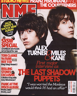
The pose is not something that looks comfortable and would not suit my magazine style, the shot framing is also slightly off.This is slightly better however the shot is not the medium style shot I was looking for.


This is the shot I chose to use, however the brightness and airbrushing tool had been used on the photo on the left hand side, this is the photo I chose to use on my front cover.

Thursday 7 April 2011

Logo

In order to make my magazine have an area of continuity I decided to create a logo to place on each page, however due to my colour scheme there were a few designs I had could have chosen so therefore decided to make some sample logos using photoshop. I took the ministry of sound logo due it being a world wide known logo and big in the RnB and Dance scene. This would therefore increase the marketability of my product. I then minipulated the image and added my own text to give the logo a different twist.
I chose to use the logo marked 2 although all the logos fit into my colour scheme, the black logo is more subtle and will fit onto each page without making a bold statement.

Monday 28 March 2011

Fonts


These are some of the fonts that I altered in order to fit with the Genre and colour scheme as well as taking into account the fonts which stand out the most. I settled on the last sample with the title Bass, I also settled on the colour scheme of red and black writing on quite a plain back ground something which can be seen on the magazines I have looked at previously.

Magazine Covers


VIBE
 Focuses more on the RnB aspect of the music world, Title is in large bubble font that stretches across the full top 5th of the page. Above this there is smaller writing in yellow and white alternate suggesting to the reader something to do with these people are inside. The mise-en-scene is black background, Drake takes up the main centre of the page showing the audience he is important and he also has black accessories. There is a yellow and white colour scheme on a black back ground, it also contains links to the website and a barcode and issue addition. The writing shown on the tshirt of the centre model is also close to the heading of the magazine. The shot used is a medium close up. There is also bright font showing an exclusive interview, showing the reader what to expect. The act that drake is wearing a black cap and tshirt on a black background could reflect the magazines African American audience.
NME
Is a more accredited magazine and more widely recognised in the music industry, its target audience is the Indy/ rock genre. There is a lot more happening on the NME cover than on the simplistic cover of VIBE, the main picture is to the right hand side and is a medium shot of two people standing back to back on a white plain back ground, the interview and description of the feature article is a lot more prominent on the cover of NME with red writing on a black background of the picture along with a quote. It also contains a bar code and issue number, the title is conventional of NME and is red with white outline and a black border. Above this there is also a news section giving the audience more information as to what to expect. All the information is contained down the left hand side of the magazine cover unlike VIBE where the information was split across both sides highlighting how Drake was the centre of this magazine issue and had made a lasting impression.

Background work

My magazine is a blend of two different genres in order to attract a larger audience. I have combined both the dance and music magazines and took ideas from some of the biggest and most widely selling magazines today. “Vibes” is one of the biggest selling RnB magazines to date and I have chose to look at the contents page due to its distinctive style. The section I have paid close attention to is the logo and layout of the word contents.


The magazine I chose to look at the front cover of is mixmag this is a widely selling dance magazine and I feel by combining both of them it will benefit my magazine greatly due to it being a very distinctive style. The part I have paid close attention to is the heading and also the spread across the centre of the page with it being very eye catching due to the font, language and colours used.

Preliminary

My contents page was kept simple as I think this has the common conventions of a school magazine due to them not being very large. The contents page reflects this however I have used some photoshop skills such as cutting out the models.

I designed my front cover around the school logo by using the blue and yellow colour scheme, the background I used was fairly dark and plain this incorporated the models dark clothes.

As part of our project we had to create a school magazine, this allowed us to become familiar with the set up of photoshop as well as experimenting whilst taking pictures. I made my magazine and contents page how I thought would best suit a school magazine.

Monday 14 February 2011

Questionaire and Audience

The audience that I am aiming for are males between the ages of 16-24.My feature article however also appeals to females due to the nature of it. The magazine is a Dance and RnB magazine so therefore the audience I am targeting is a one that is interested in both genres. However in order to back this up I have created a questionnaire.


I order to give my magazine the largest audience possible I created a questionaire to find out what current genre of magazines are popular and what age my target audience is, as well as price range and artists they like to read about, this lead to me creating a questionaire and handing it out to as many people as possible. I hope by using this questionaire that I can reach my target audience and connect with them.

Questionaire
 Circle the answer most appropriate.


Gender ?

Male          Female
Age ?

14-16              17-20              21-24             24+
Do you read music magazines?

Yes               No
What genre of music magazines do you usually buy?
                                                                                                                                                                             
RnB                          Dance                    Indie                      Rock                Heavy Metal        Other

If other please state..................................................
How much would you usually pay for a Magazine?
                                                                                                                                   
£1.00-£1.99           £2.00-£2.99           £3.00-£3.99         £4.00-£4.99         more?
How often do you purchase a magazine?

Daily                    Weekly                    Fortnightly                    Monthly        Other

If other please state................................
What catches your eye most in a magazine?


  Photography             Editing            Text              Feature Article               Artist on the cover
Who would you like to see on the magazine cover?


A group           A male artist                A female artist

What colour scheme do you prefer?

Light                Dark               

How many colours would you like to see on the cover?


One          Two          Three        Four       More than Four


Flat Plans :)


This is the flat plan for my feature article, it consits of the article which is a question and answer article accompanied by a few pictures, as well as a quotation headline to break up the article.


This is the Flat plan for the cover of my magazine, the only difference being that the text down one side of the main image, will also be down the other side to make it symetrical.

Thursday 10 February 2011

This is a poor shot as the framing is out of proportion and if the photographer was going for a low angle shot the camera should be pointing up instead of directly along the floor. This is an example of poor photography.

This can be seen as a good medium shot of a model as it captures them from the waste up. This would not usually be used as a Front cover due to him not looking down the camera lense, however it would be seen on a feature article.
.
Origionally I chose this Establishing long shot to be the picture for the cover of my magazine however, I chose a medium shot to use with a model. This picture was used as a smaller image in one of my sub articles so that the shot was not wasted. This can be seen as good photography

Ideology

Ideology is a belief system and how people see things, so the tags that are used are important, due to how your target audience see the tags. It is used in media to direct how people see things e.g. pictures and text and how they feel that these images and pieces of text will lead to the thing that they want to see.

Thursday 3 February 2011

This is my final contents page.
As can be seen here the title is yellow and blue as oppose to blue and yellow, the writing also reflects the colour scheme of the logo, again I felt the back ground was too bland so added a gradiented back ground as I had done on the front cover.
I also had to create a basic contents page and took a selection of smaller pictures to use. I also chose to make the title the opposite colour scheme as on the front cover.

This is my final front cover.
After playing around with the writing I decided to keep the colour scheme reflecting the logo, however it left the magazine feeling blank. I then decided to add in a Gradient back ground to add a bit more depth to the front cover and I am happy with how it turned out. I did not include a bar code as with it being a school magazine it would not be scanned and are usually free. I also included a website to make it more real and give it a multi media feel.

I then proceeded to alter the image and put it onto a plane background surrounded by some Text that followed the conventions of a typical magazine

We recently started our premlimanery magazine, and set about taking pictures from all around the school. I chose a picture taken on the spur of the moment and set about altering it using photo shop.

Monday 17 January 2011

During our lesson on the 13th of January we discussed the conventions of a front cover of a magazine, these included a main picture and eye catching writing styles as well as colours. We also discussed how some of the storys contained inside should feature on the front cover to give the audience an idea of what to come, no only this but your magazine must target a specific audience. We then discussed the contents page and feature article and how the contents page could be a more difficult task as I have to think about it as if I was producing the magazine. The feature article not only has to look proffessional, but also has to read gramatically correct.